The Colour Scheme Secrets the Pros Don't Want You to Know
Drafting Quotes
from local draftsmen

Colour Scheme Secrets
Choosing a colour scheme for your home can feel overwhelming. But don't let the experts trick you into thinking you're not good with colour. It's in their interests to keep the secrets behind their 'flair' for colour to themselves. But I'm about to share some insider techniques for developing your own stunning colour scheme. After all, your home should be a reflection of your personality. So what are stark white walls and mismatched furniture saying about you?
So check out some of these professional level ideas to come up with your own winning colour scheme:
Copy from Nature
Don't be ashamed to copy mother nature -- she's the world's best colour coordinator.
That doesn't mean you need to paint your ceiling sky blue, your walls tree green and tile the floor with muddy brown tiles (that might work, but it's not the best option).
The stunning colors of local birds or flowers can provide the perfect inspiration for a colour scheme for your home. It will feel even more special knowing your home reflects your local area.
Picking out the green in a bird's plumage is one thing, but how do you find a paint colour to match?
A great tool for matching an image with a paint colour is Osmosis Colour Pot. Using a photo editing program, you can input the RGB colour code of any image or colour you like and it will match it to paint colours for you. That's how the stunning olive greens in the image below were matched to a similar colour in the Dulux range -- 'Beanshoot' -- and Amerind -- 'Envy'.
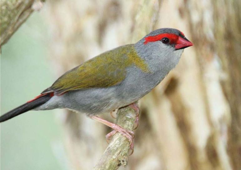
Above: An Australian native bird, the Red-browed Finch has a georgeous combination of greys, olive greens, red and black.
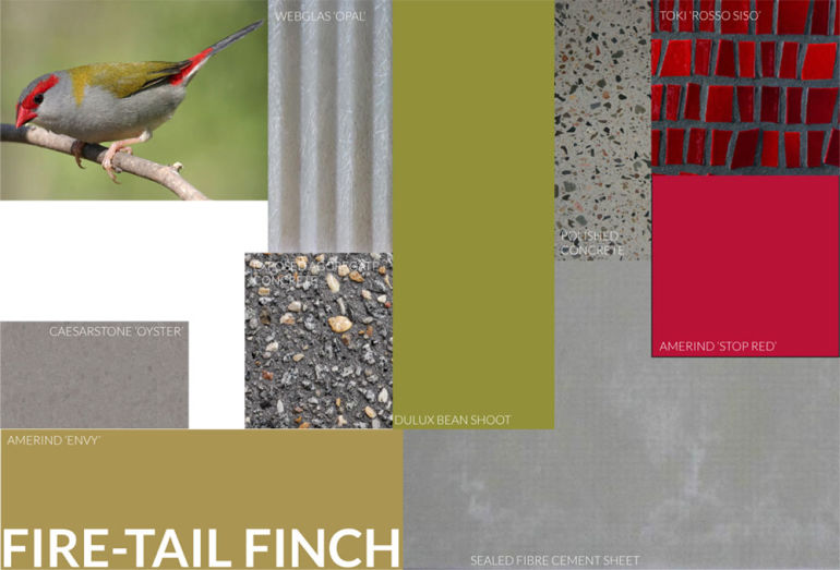
Above: The unique colourings of the finch inspired this colour scheme. Without Mother Nature's help this colour scheme might never have been conceived. An added bonus is that the house that uses this colour scheme will be uniquely linked to the area it's built in.
Nature hasn't been wrong yet and there are so many pre-made colour combinations out there, you just have to take a look.
Take Inspiration from Something You Love
A painting, sculpture, even a book cover that you love can be the perfect inspiration for a colour scheme that will reflect who you are.
Even a favourite cartoon character can inspire a colour scheme. In this tiny studio apartment, the owner's childhood fave, Mighty Mouse was used for colour inspiration. Mighty Mouse's red, yellow, black and white colours are used to create a striking and individual colour scheme -- appropriate because Mighty Mouse packs a big punch for his size, just like this versatile studio layout.

Above: Mighty Mouse, popular '80s cartoon super hero.
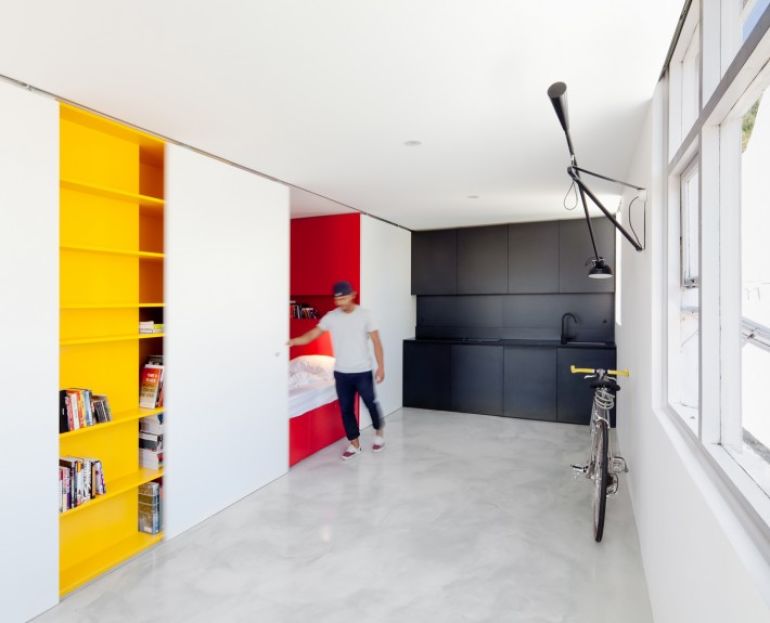
Above: Mighty Mouse's red, yellow and black colours inspired the design of this studio apartment. Just like the cartoon character this small space punches above its size. The bold colour choices definitely help enliven the small space.
Keep your home feeling individual by using your favourite objects, art or TV Characters for inspiration.
Be Brave
Honestly, with the right foundations, it's virtually impossible to go wrong with colour. So don't be afraid to experiment.
Here are three crazy colour combinations from Home Beautiful that actually work. Almost nobody would be brave enough to try mixing these colours, but look how amazing they look!
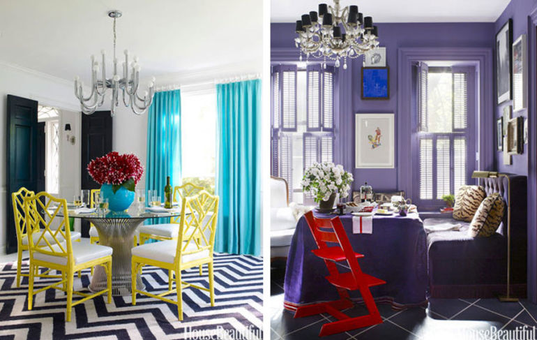
Left: Lemon, Teal, Black & White
Right: Purple and Red
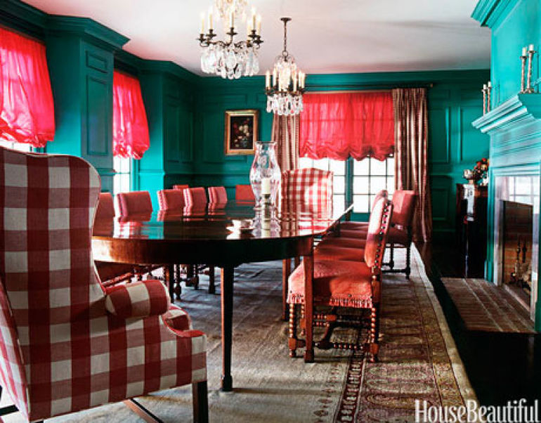
So, be brave. After all, it's only paint.
Think Texture
There's nothing inherently wrong with all white colour schemes. The problem with white -- and the reason it ends up looking sterile and boring -- is a lack of texture.
So if you do decide to go with an all white -- or any monochrome colour scheme -- makes sure to incorporate a lot of texture.
Rough, smooth, gritty, shiny.
Make sure your materials run the entire gamut. Painting brickwork, plywood or timber panelling reveals the material's texture without the colours becoming distracting. A home with a range of textures will feel rich and interesting, no matter how white it is. A house filled with white plasterboard on the other hand…
Remember texture and you can't go wrong, even with an all-white palette.
Check Out Colour Forecasts
Every year, paint companies spend a lot of time and money trying to predict the future of colour.
They send their reps to design exhibitions and fashion shows to bring new colors and palettes back from Europe and the U.S.
Then they create a colour forecast for the year ahead and release new colours to keep up with the latest trends.
If you take a look at a colour forecast from previous years, you'll find some great combinations and ideas just waiting to be snapped up. They're palettes designed by professionals -- you'd be silly not to see if you can find your winning colour scheme amongst the options.
Here are some of Dulux's forecasts for 2014:
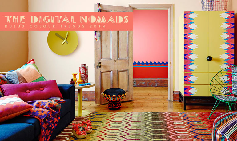
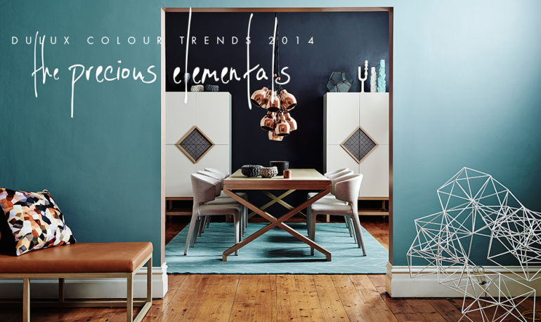
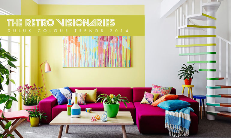
Above: Striking colour combinations abound in paint manufacturers' colour forecasts. Why not steal from the experts (they'll never know).
Trust the professionals. They know their stuff.
Now What?
Or, if you're having trouble and need some professional advice? Don't worry, our stylish colour consultants and interior designers are ready to help.
So what's stopping you? Transform your home with a splash of colour today!
About the Author
Brodie Norris runs Lunchbox Architect, which features one architecturally designed home each weekday. Recently Lunchbox Architect featured that clever Mighty Mouse inspired studio.
Drafting Quotes
from local draftsmen
![]()