8 Melbourne Cafe Designs You Should Steal for Your New Kitchen
Interior Designing Quotes
from local interior designers

1. Feast of Merit, Richmond
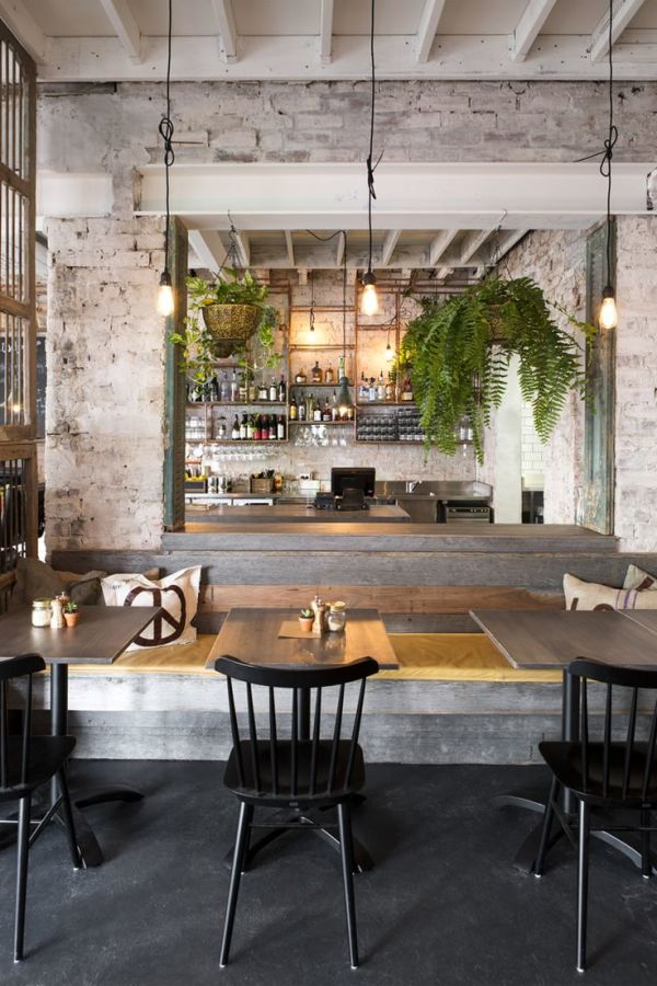
Steal the Look...
If you're lucky enough to have an exposed brick wall in your kitchen you could consider an industrial-chic look like this. White-wash the bricks to soften their influence, add some exposed pendant lights, incorporate some open shelving to store items that are both functional and beautiful - think plates, glasses and platters, and pair with black chairs in classic shapes. Soften the whole look with some hanging plats and you've got a classic rustic look for your kitchen.
2. Hams and Bacon, Brunswick East
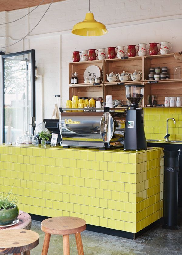
Steal the Look...
Don't be afraid to use a bit of colour is the secret to stealing the Hams and Bacon look. It doesn't have to be a zesty yellow like this, but any statement colour can add some real personality to your kitchen area. The colour works especially well because it's neutralised by grey concrete, white walls and raw timber furniture. The joinery units in your kitchen offer a good opportunity to experiment with colour. Or, if you have an island bench like this one, why not steal the idea completely and tile the island with an outlandish colour. Another great part of this look is the square format tile laid in a stretcher bond pattern, it adds some interest to what might be a completely boring tile shape. Bring your colour of choice back into focus with similarly hued accessories like cups and pendant lights.
3. Industry Beans Warehouse 3, Brunswick
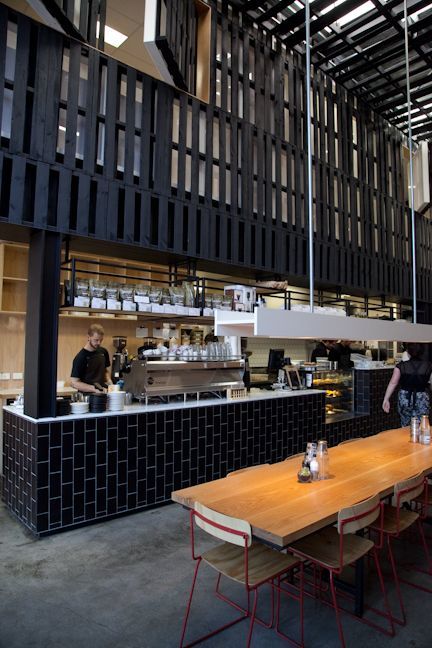
Steal the Look...
Timber and black have never looked bad together. Follow this rule and I promise you can't go wrong. The trick here is minimising the use of black to one zone and using various types of natural timber everywhere else. This warms up the black and prevents if from dominating. You could consider a completely black kitchen along the wall (why not splash out for black sink and taps as well, they look very sophisticated) and warm it all up with a timber island bench and dining room furniture? It's a classic, sophisticated look.
4. Fish Market, Richmond
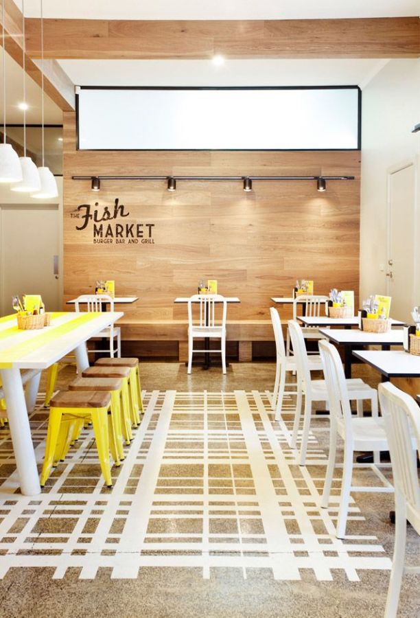
Steal the Look...
This bright modern look easily lends itself to being replicated in residential kitchens. Go with white cabinets (you probably are anyway, right?) and then clad a feature wall in timber. You can use floor boards and glue them up the wall. Bring in a statement colour. Yellow works well because it's sunny and bright, but fresh greens or even deep reds also work well. If you have polished concrete floors like this, consider creating a modern painted 'rug' in the meals area to really establish a sense of space in that area. All-in-all this look is a good way to prevent white feeling sterile and boring.
5. Threefold, Melbourne
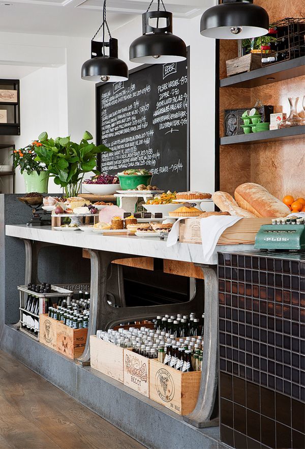
Steal the Look...
If you're a bit of a hoarder (and who isn't?), this could be a great kitchen style to put your odds and ends to good use. Gas cylinders (professionally dismembered, of course) for pendant lights, an old workbench becomes a great bench-top, old wooden crates as makeshift drawers. You can even paint one wall with chalkboard paint to create your giant shopping list. The mis-match of rustic materials looks inviting against the palette of glossy black tiles and white marble.
6. Golden Fields, St Kilda (Now Closed)
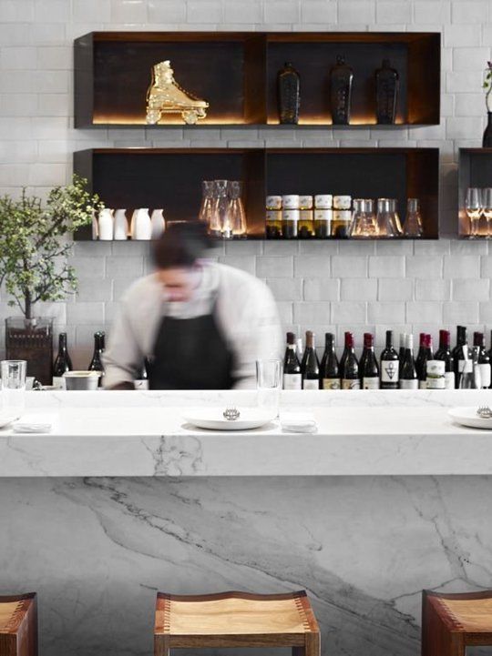
Steal the Look...
Marble paired with dimensional white tiles, to add a little texture. Plus sleek shadowbox-style upper 'cabinets'. Make sure you add lighting to your 'cabinets' to achieve this lush look. Can't hurt to show off your collection of fine reds, either ;)
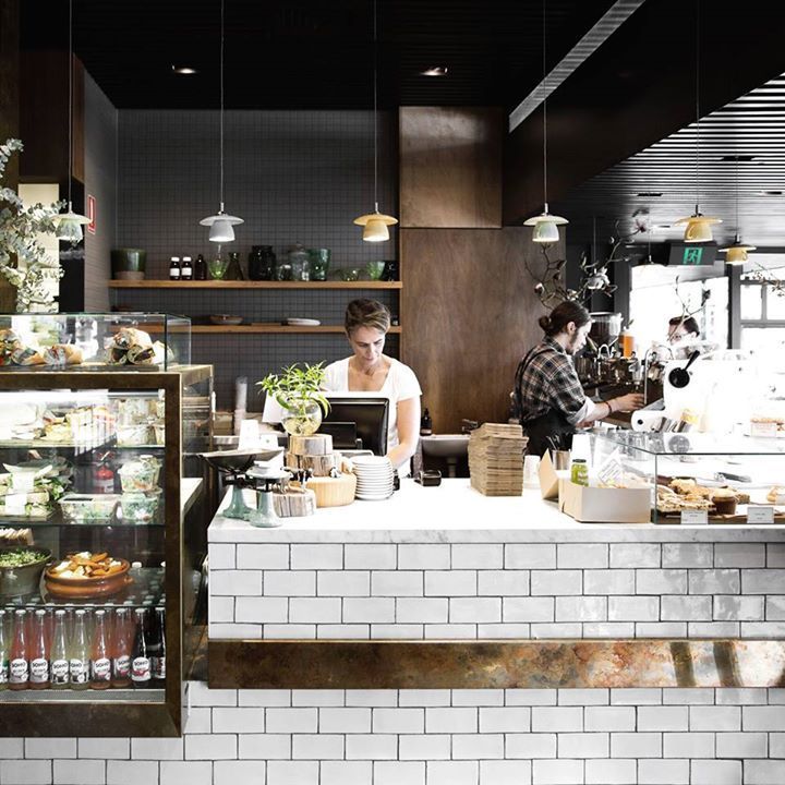
7. Top Paddock, Richmond
Steal the Look...
Chocolate, coffee and milk froth could be the name of this kitchen look. And how could you go wrong with that combination? What works really well in this cafe is the combination of textures. The white tiles have dimension and texture to them, giving them and intriguing shimmer. The copper strip breaks up the monotony of the white (and white does become monotonous, trust me). This is all set against as sophisticated backdrop of wood grain and dark, moody tiles - again of contrasting textures. The teacup pendants are a quirky touch.
Interior Designing Quotes
from local interior designers
![]()