How to Choose a Paint Color
Painting Quotes
from local painters

Whether you are planning to decorate your home or refreshing the feel of your workplace, choosing between the thousands of shades of a paint color can prove to be utterly confusing. Spending ample time on getting the colors right has its definite worth - it is the color theme that accounts for more than 70 percent of our collective response (positive,negative or neutral) to an object or a place.
The color of a room has the uncanny ability of making a particular space appear absorbing, energizing, and tranquil. Moods can be set and flaws can be camouflaged by choosing an appropriate paint theme. A paint job is one the most effectual (and one of the least costly) transformations to morph any given space.
Four Wise Tips:
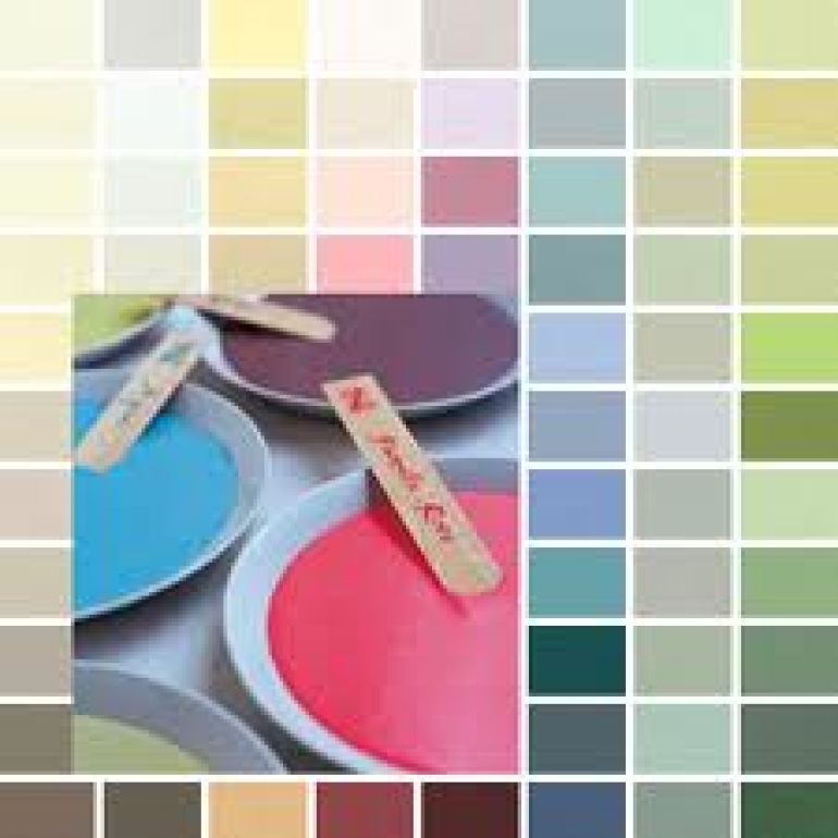
Not everyone is skillful when it comes to choosing a paint color. A whirlpool of available options is more than enough to confuse you. A bunch of outright useful tips to simplify the choice of paint color are presented below for you to make the most out of.
1.Figure out the required mood:
While choosing a color, the first thing you would want to thoroughly research is the mood you are aiming for. In, say, your bedroom, what feel would you prefer to be in the air? Serenity, intimacy, drama - what would you be siding with.
Deciding on a predominant emotion governs the appropriate paint color selection. You would naturally want your workplace to be sociable, creative and intellectually stimulating - the particular emotion-set needs an altogether different corresponding color theme. Same goes for calculating higher energy levels and restfulness. As a rule of thumb soft and neutral tones lead to placidity. Bright, warmer colors result in vigour and excitement.
2.Put a color wheel to the use:
Familiarity with the standard color wheel can go a long way in the process of choosing the right paint color for your sanctuary. For beginners, a color wheel is the fundamental tool to develop a thorough understanding of the fundamental relationship between varying hues.
Red, Blue and Yellow (the primary colors) serve as the basis function for formulation of the color wheel. When combined, the primary colors give rise to the secondary colors. Moving on the parallel lines, the amalgam of secondary colors gives rise to the tertiary color set (hence, the fourfold band spread).
3.Assess your color scheme:
Color schemes can be classified as falling under three basic categories. Complementary schemes are formulated by picking up a primary and secondary color, each from the opposite ends of the wheel. The Neutral scheme comprises of colors not included in the wheel. The Analogous scheme thrives on warm tones (yellows,oranges and reds) and the 'cool' ones - greens, violets and blues.
4.Evaluate the ambient lighting:
Similar colors appear to be different under varying ambient lighting condition. It is, then, only logical to view the paint chips under the sort of light you are be planning to fill your room with. A word of caution here - natural and artificial lighting effect the color appearance differently, so don't be surprised if you land yourself a look that isn't exactly what you were looking for.
Before you take the dip:
Slight originality is bound to do wonders here: select a color and have an A4 sized piece of white cardboard painted with it. Once dried, stick the board to the wall, take a few steps back and re-evaluate the feel. Grab yourself a can if the exercise turns out to be success, or back to the drawing board.
Hire a Professional
Don't take the risk, hire a professional painter instead. For the best pre-qualified painters across the country head to http://www.servicecentral.com.au/painting/
Painting Quotes
from local painters
![]()